
Why not try making a book trailer?
... Or How to (bumble your way through and) Make a Book Trailer in Three Easy Steps!
Full disclosure, until March my only experience with picture book trailers was watching dozens while procrastinating! This changed when I met up with some of my fellow children's book creators for coffee. As we sat there guzzling caffeine, comparing notes and giving encouragement, my cohorts put forward the idea that I create a book trailer for my latest picture book Brothers from a Different Mother. I've always been fascinated with the little videos, but somehow it never occurred to me to make one for my own books. I didn't really know how to start but I have found over the years that I learn best by just jumping in boots and all. After all, if I accepted the challenge, I was only planning a modest little experiment ... just something simple because I would be "learning on the job". Easy Peasy...right?
Step One: Research
My first step was to reach out to fellow children's book creator Dee White. I knew that she had created several book trailers and I hoped that she could point me in the right direction. She generously came through with these tips:
- Write a script first … a book trailer is kind of like a visual blurb so you have to decide which parts of the story you want to tell. You only have a short time to hook people into your story.
- It should be less than a minute if possible.
- Don’t tell the whole story … just enough to entice people to want to know what happens in the end.
- Try to capture the essence of the story … the tone and theme etc.
I jumped back into watching book trailers, but with these parameters in mind I watched with a more critical eye noting things I liked and didn't like. I tried to determine which elements were successful in "capturing the essence of the story".
I also consulted my good friend Google to get a little overview on the technical side of things. I needed a computer program to pull the video together and there are a lot of options out there. I work on a Mac and already had iMovie, so in the end my selection was a no brainer.
Step Two: Gathering the Ingredients
Following Dee's advice, I started considering my script. I needed something that captured the essence of the story but didn't tell the whole story. In my case, I didn't need to look any further than the back of the book. The blurb really met all the criteria in a concise way that reflected the theme and the tone of the story. It had the added bonus of having already met the approval of the publisher and author!
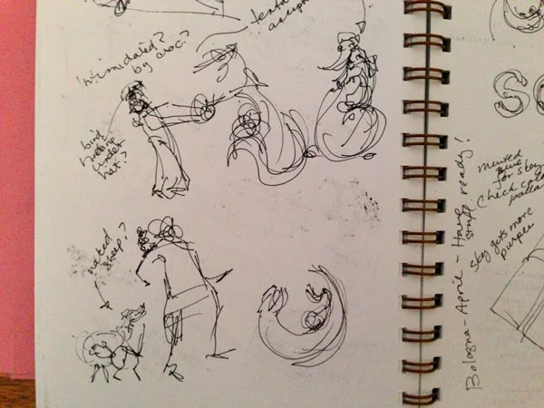
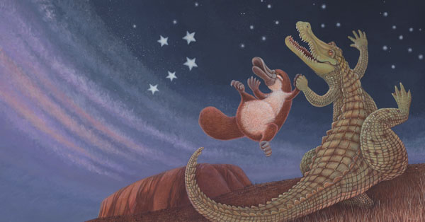
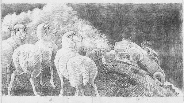
Once I had the framework of the script, the visual narrative and selection of images fell easily into place. I must admit that it is a distinct advantage in being the illustrator and having all of the illustrations on hand. I chose and modified my illustrations, cover art and logos and placed them tidily into a folder ready to import into iMovie.
My next task was to find some appropriate music for a soundtrack, and once again, Google was my friend. The music had several criteria it needed to meet: the author Phillip Gwynne wanted it to reflect a jungle environment and the publisher wanted it to feel energetic and joyful. I wanted it to have all of the above plus to be royalty free, have the correct licence to be used in this sort of project, and have the capacity to be edited to just a minute long.
Finding the right music turned out to be one of the hardest parts of the project. I was amazed at how different soundtracks really affected the tone and the energy of the trailer and felt it was well worth spending the time to get it right. I had to "kiss a lot of frogs", but in the end I found some lovely tunes on Purple Planet Music.
Step Three: Putting it Together
My decision to use iMovie to assemble the book trailer was simple: it has more than enough capability for my simple project and it was already loaded on my Mac. There are ample tutorials on the internet about the technical aspects of using iMovie so I'll concentrate instead on the editorial decisions of pulling the elements together, shaping the trailer and telling the story.
Keeping in mind Dee's tip to "capture the essence of the story", I decided not to use any of the preset "themes" which are available in iMovie. They are all very cool but they have their own flavour ... which wasn't the flavour of my story.
I imported my preselected images and music into iMovies, dragged them into the timeline and began the process of tweaking and shaping the trailer.

My "ingredients" sitting in my iMovie media folder.
I roughly assembled the images into the iMovie timeline to create a visual narrative that matched my script. The next step was to determine how much screen time would be needed for each phrase from the script and what would be the best style and placement for the text.

A portion of the timeline showing the images, text and some transitions.
Once again, iMovie has quite a number of preset options for text placement and animation, but I was keen to find a solution that didn't distract from the storytelling. I was also mindful of legibility and worked hard to ensure that the text contrasted nicely with the background and remained on the screen long enough to be easily read by a child.
Some of the preset options for text placement and animation.
I thought it was important to match the fonts which are used in the book and fortunately I was able to import the distinctive font that we used on the front cover.
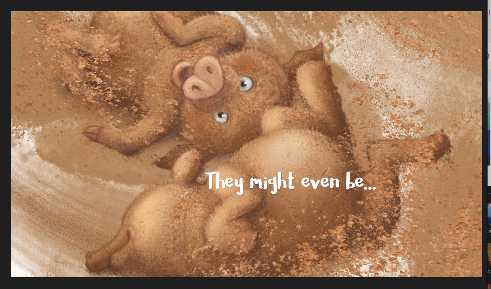
I matched the fonts from the book and made sure that there was sufficient contrast with the background to allow for legibility.
Next I added in animated transitions between the images. Once again, iMovie provides a lot of options, but I really didn't want anything that would distract from the story that I'm trying to tell. For the most part I stuck to a simple cross dissolve.

There are a lot of transition options available but choose wisely or they might become a distraction.
Finally I added in the music and that's where the real editing began. The music really influenced the pace of the transitions, when text would appear and disappear, the speed of the animation. I was able to edit the music to better match the storytelling and to adjust the overall length of the trailer. It really was a matter of circling around and around and making little tweaks until it felt right. I found that it was an organic process — a bit like moulding clay, with some pushing and pulling and happy accidents.

The book trailer timeline including the music track.
Of course I closed the trailer with an image of the book cover and all the appropriate credits, including the required credit for the use of the music soundtrack.

Communicate — Don't Decorate
Creating a book trailer for Brothers from a Different Mother was a great way to "learn on the job". I learned about some of the general demands and options for making a book trailer but it kept me focussed on finding a solution for one specific book.
There are a few embellishments that I could have utilised for this project, including simple animation. For example, the butterfly could fly across the frame or splashing mud could create a transition between images. There really are a multitude of possibilites but I felt "less is more" was the right approach for Brothers from a Different Mother.

I could have added simple animation such as having the butterfly fly out of the frame.
I was happy with my solution for this trailer because it conveys the energy and joyfulness of the book and because I didn't succumb to adding elements which would have been a distraction from the story telling. I discovered that it was a lot like the editing process for creating the visual narrative for the picture book illustrations. There are a lot of possibilities, but you must always be mindful that your choices must serve the story. Anything else is just a distraction.
#creatingkidlit